Site experience refresh for the Microsoft Store on windows.com
For the 2023 Back to School season we were asked to refresh the Windows 11 for College Students homepage and the e-commerce experience for purchasing laptops to make the purchasing process easier and clearly educate users on new Windows 11 features.
Deliverables
UI Design
E-commerce
Prototyping
Time frame
1 month
Applications
Figma
Role
Lead Designer (Code and Theory)
Creative Direction
by Erik Jarlsson
Development: HCL Technologies
Problems & audit insights from the existing Microsoft Store user experience
- The existing page focused a lot on technical specs with no descriptions of what they mean
- In the product detail page, the different product configurations such as color, memory, finish etc weren’t clearly laid out and were displayed in a repetitive manner, making the choices confusing
- Certain features were highlighted in the Product Listing Page that didn’t feel important and weren’t helping in filtering out products
- The opening hero module was taking up too much vertical real estate so the actual product cards were getting pushed down the page.
- UI elements felt inconsistent and outdated
![]()
Measurement of Success
- A sense of ease in the shopping experience
- Educating the users on the new features of Windows 11
- Help users make informed decisions based on their needs, whether it be laptops for gaming, school or work
- Increase the brands rapport by providing a more up to date visual style and seamless interactions
Highlights of our solution
We worked on making the experience more intuitive, reducing cognitive load and reducing the number of interactions the user needed to do in order to find and purchase products of their choice.
- Clearly defined hierarchy in the PDP section with equal focus on the purchase options, product features and imagery
- Reduced the vertical height taken up by the header module on the PLP and simplified the filters to make the choices straightforward for the users
- Refreshed the look and feel of the pages by adding up to date UI elements, seasonal brand elements and photography
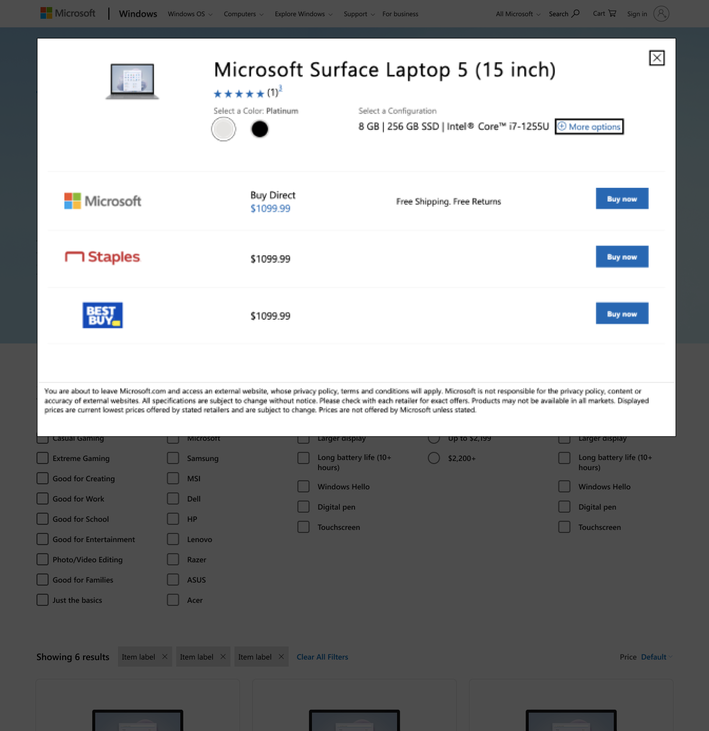
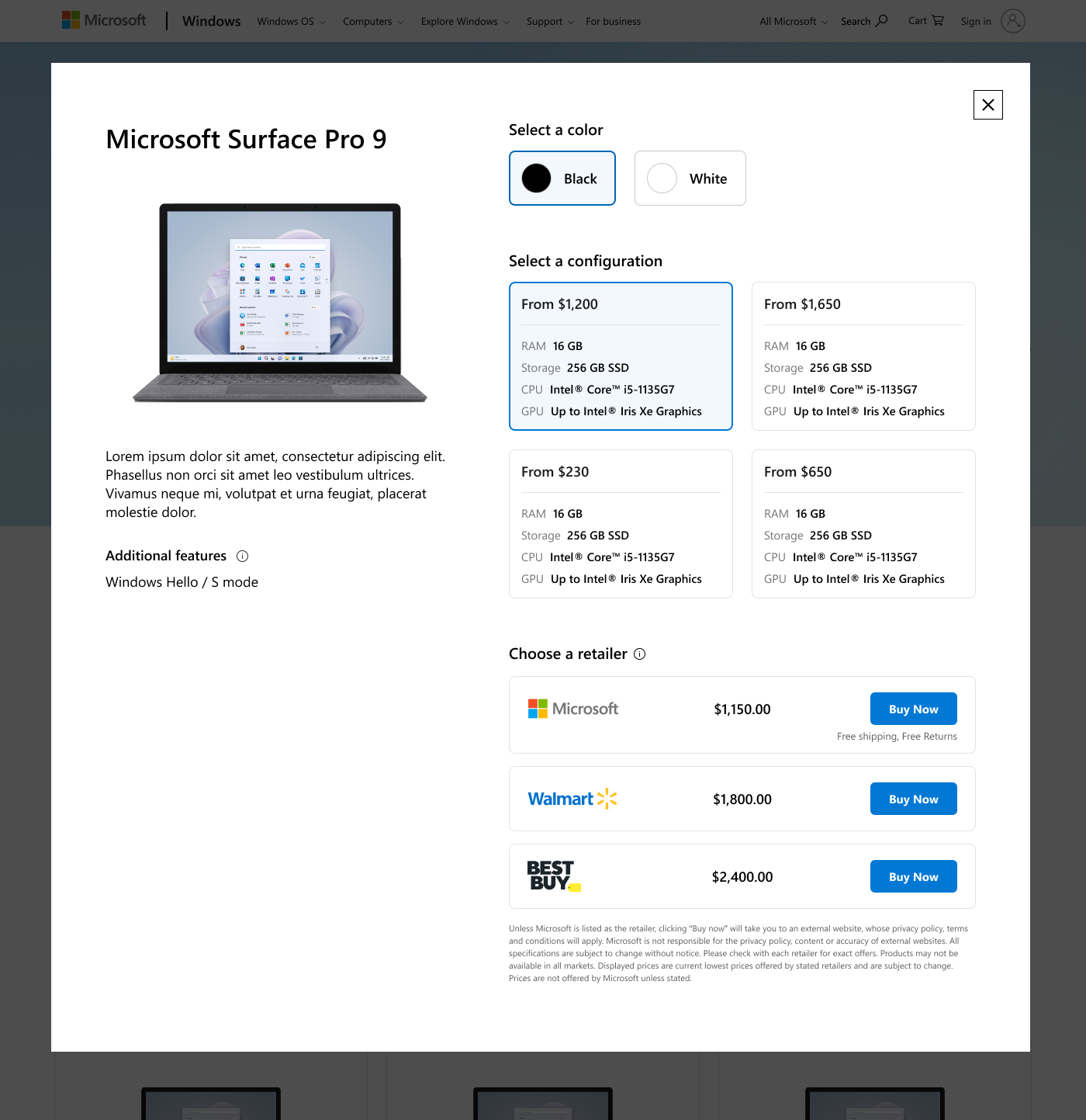
PDP
Before ︎︎︎
![]()
After ︎
![]()
Product imagery, features and description are sticky while you scroll through the configurations so you always have the information at handy. The price, specs and storage information is grouped in order to help users make more informed decisions.
Detailed case study available on request!